WESTERN & BOHO ICONS: BEST PRACTICES FOR A MODERN LOOK
Aesthetics is not a costume, it's a syntax. Western icons and boho forms saturate our feeds, but simply sticking on a hat and a feather isn't enough to tell the world's story. What distinguishes a cliché visual from an inhabited one is how the image breathes, the relationship between the sign and the space, the hierarchy that lets the subject speak. Modern Western isn't a caricature of a duel; it's a slow tension, tarnished metal, a horizon hinted at off-screen. Contemporary boho isn't a patchwork of hippie motifs; it's a peaceful geometry, linear curves that organize light and frame typography.
The formal grammar that avoids style mistakes
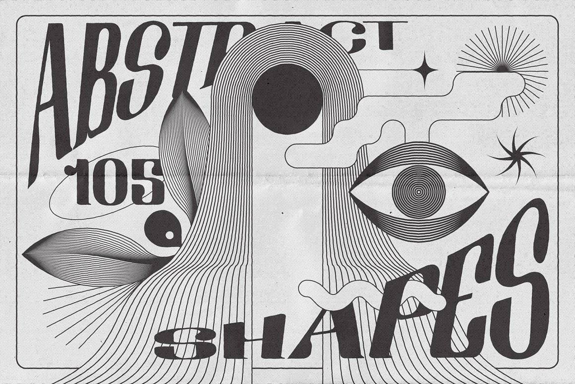
An effective identity or cover first builds its alphabet. The main sign carries the intention, secondary ornaments punctuate the sentence, backgrounds structure without shouting. In this logic, a consistent set of assets saves time and avoids the pitfall of collage. The +320 Western Icons and Illustrations pack on HYTRAPE provides silhouettes, attributes, ornaments, and pictograms drawn with compatible line thickness, allowing for fluid layout from poster to social carousel. In contrast, Abstract Boho Linear Vector Shapes offers minimal linear forms capable of structuring an editorial template, supporting a photograph, or accompanying a title without stealing the show. By combining these two sources, you get a stable vocabulary and immense room for play.
Colorimetry, texture and light for modernity
The Western boho duo loves calm contrasts. Earth, sand, charcoal, desaturated brass, midnight blue, and cream palettes preserve typographic legibility and highlight the finesse of the lines. The material should remain in the background. A subtle paper grain or barely audible film noise adds life without transforming the plane into a dusty set. Light should guide, not shine for its own sake. A sunset is suggested by a soft side glow, or a metallic highlight is caught on a major icon. We stay below the spectacular, because the promise of an album, a brand, or an event is read first in the arrangement, and only then in the effect.
Typography and composition ritual
Well-executed classicism is better than noisy virtuosity. A wide-set contemporary serif title perfectly complements a second sans-serif voice with soft angles. Western readily calls for generous weight and designed serifs, but the key lies in letter spacing and capital consistency. Boho welcomes lower case, airy leading, and thoughtful punctuation. The composition ritual always begins with a sketch: a main sign near the title like a signature, two or three boho forms as background architecture, a reserved photographic space, and typography that rejects anecdotes. This simple writing holds up in series and supports seasonal variations.
Music, fashion, editorial: three clear applications
Western boho iconography naturally serves wide-ranging music, from folk trap to contemplative R&B. It dresses merchandise releases with a sense of material that bridges textiles and screens. It structures long-form editorial content by offering discreet, recognizable, almost liturgical tagging. On a cover, the stylized cowboy becomes a totem, boho shapes become veins. On a product sheet, the icon becomes a system of pictograms. On a poster, the whole tells a geography rather than a static scene. Everything holds together thanks to clean assets and sober use.
Start now
Open a clean document, place a photograph or a solid color, call a Western symbol as a signature, and arrange three boho forms that depict breathing. Set the typography in a simple grid, check in black and white to validate the hierarchy, reintroduce color, adjust the material. This process fits on one page and is quickly learned if the resources are well-designed.
For a reliable foundation, +320 Western Icons and Illustrations and Abstract Boho Linear Vector Shapes offer the best of both worlds: character and neutrality in service of an identity that never confuses reference with cliché.
Share: