
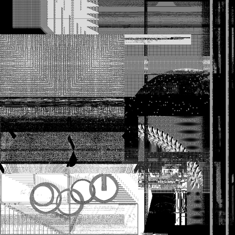
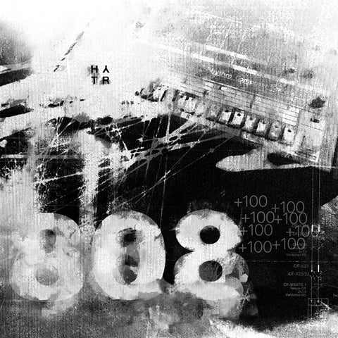

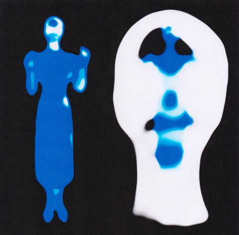
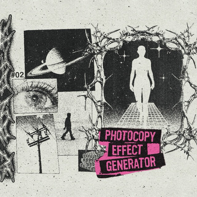
The photocopy effect imitates an image run through a copier: crushed blacks, grainy grays, irregular edges, toner marks. You see it on posters, zines and album covers. In Photoshop, you can build it by hand without ever destroying the original image.
The non-destructive method in 5 settings
- Convert the image to a smart object. Right-click the layer, then Convert to Smart Object. Every setting stays editable.
- Add a gradient map. A Gradient Map adjustment layer with three or four stops (black, mid gray, off-white). Keep the midtones alive: that is what gives the photocopy break.
- Adjust Levels or Curves. Anchor the blacks without clogging them, lift the grays.
- Add a paper and toner texture. Blend mode Overlay at 10 to 25%, then dirty the edges with a mask.
- Finish with fine grain. Filter > Noise > Add Noise, between 0.7 and 1%. It breaks the digital look of the image.
Two moods worth saving as presets
- "Neighborhood mag": harsh contrast, visible grain, marked edges.
- "Fresh copier": preserved midtones, discreet edges, a slight 1 to 2 px blur for toner diffusion.
Save time with an action or a pack
To avoid redoing these settings for every visual, start from an action or a pack. The first three are free:
- The Grunger: free action by Studio Won: halftones, screen prints and photocopies in one click.
- Daily Mail Print Action: free action for an old-print colored dot texture.
- Monochrome Square Halftone: 5 high-resolution halftone images, free.
- PhotoCopy Effect [By Züli]: 7 photocopy effect styles, 22 textures, 6 printed patterns and 200+ gradients.
- PHOTOCOPY CREATIVE PACK: the CopyCat action, image effects and textures to recreate worn photocopies.
Keep going: grunge textures, text effects and our 11 free text effects.
Print or web: realism without bad surprises
Build in RGB. Export as WebP for the web when performance matters, as PNG if you need transparency. For print, convert to CMYK at the end, flatten the sensitive blends and check your blacks (K 95 to 100% for text). The goal is not to fake the analog look, but to evoke it without breaking the production chain.
Mistakes that show
- Too much contrast. The image becomes unreadable.
- Too much dirt. The effect loses credibility.
- A visible trick. If people notice the trick, it is too strong. Irregular edges, barely visible grain, midtones that breathe: the illusion lives in these details.
Frequently asked questions
How do I make a photocopy effect in Photoshop?
Convert the image to a smart object, add a gradient map, adjust Levels, add a texture in Overlay and finish with fine grain.
Is there a free photocopy effect?
Yes. The Grunger, Daily Mail Print Action and Monochrome Square Halftone are free on HYTRAPE (list above).
Can I apply it to text?
Yes, with the same settings on text converted to a smart object, or with an action such as Text Trasher, described in our text effects guide.


Share: