

A good glossary doesn’t just pile up names; it creates actions. Each effect here can be summarized as a promise, an application, a pitfall to avoid. The goal isn’t to “try everything,” but to learn to choose. Once the intention is set, the technicality becomes simple.
A — Chromatic Aberration: Micro-splitting of RGB channels at the edges to catch the eye. Useful in small doses, dangerous at 100%.
B — Directional Blur: It simulates speed and guides readability; only one axis, otherwise the image collapses.
C — Liquid Chrome: 3D volume or highly contrasted alpha PNG, side light, short shadow; a single object is enough.
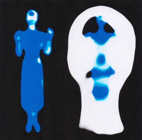
D — Duotone: Two primary colors to reduce complexity and stabilize identity; requires sharp contrast.
E — Discreet Emboss: Subtle relief on a typographic sign or pictogram; beyond that, it screams.
F — Film Grain: Fine, regular noise, applied after composition; switches off the “computer,” turns on the eye.
G — Glass/Refraction: Controlled reflection, clean mask, sister shadow; the shadow reveals the truth.
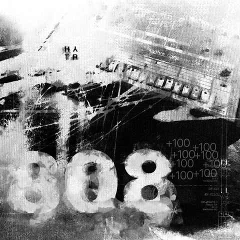
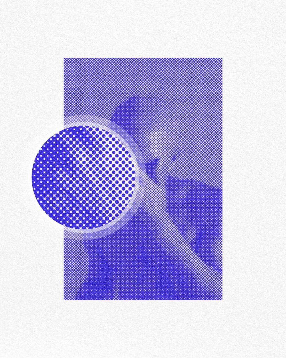
H — Organic Halftone: Density-based screen, non-destructive; finer than the “pop art” caricature.
I — Ink Bleed: Ink smudges for the scent of paper; a beautiful smudge is better than a wall of stains.
J — JPEG Crush: Deliberate artifacts for chic "low definition"; works if the subject remains sharp.
K — Kinetic Type (Static): Variations in weight and serif simulating movement.
L — Controlled Lens Flare: Small localized glint, never right in the middle; serves the composition, not the other way around.
M — Mineral Monochrome: Ivory/black/slate + discreet accent; ages well.
N — CRT Noise: Scanlines and slight “roll” for framed nostalgia; information is paramount.
O — Old Painting: Pictorial patina to humanize an overly smooth rendering; soft edges, limited colors.
P — Photocopy Edges: Dirty borders at the edges of solid colors to anchor in the analog.
Q — Quartz Glow: Soft halo around a white object; subtle, otherwise it's soap.
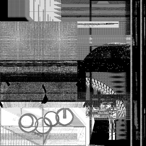
R — Risograph: Screens and "live" inks, intentionally imperfect overlays; readable first.
S — Implemented Screen Print: Overlay of two spot colors; clean separation + inking order.
T — Tape Edge: Photographed adhesive edges; glue is a material, not a gadget.
U — UV Pop (Accent): Discreet neon on a neutral palette; only one accent per plane.
V — Vignetting: Darkening of edges to focus attention; 10–15% is enough.
W — Typographic Warp: Deformations held by the grid; a curve, not a tornado.
X — Xerox Wash: "Washed" gradient like reprography; preserve deep blacks.
Y — Yellowed Paper: High-resolution yellowed paper, slight toning; neutralize excessive greenish tint.
Z — Zoom Grain: Sharpness slightly drops, micro-shake; the image stops being “flat.”
Each effect can fit into an image if we set up a triptych: need (why), dosage (how much), proof (where). A successful poster doesn’t combine twelve recipes; it chooses a voice, a material, an accent.
HYTRAPE Resources to link (useful packs for "making in 1 image"):
ANALOG HALFTONE MAKER for controlled fine screens.
OLD PAINTING ACTION to add patina to a clean rendering.
INK BLEED TEXTURES — 4K for realistic smudges on solid colors.
CRT NOISE & VHS TEXTURE PACK for discreet roll and scanlines.
TAPE EDGE — REAL SCANNED EDGES for credible glues.
POSTER GRID SYSTEM — PSD BASES for composing without losing alignment.


Share: