FOOTBALL JERSEY MOCKUP: PRO METHOD, FREE FILES AND ERROR-FREE EXPORT
GOAL: A JERSEY THAT WORKS IN PRESENTATION AND PRODUCTION
A mockup is not a gadget: it’s the visual prototype that lends credibility to your concept, allows you to iterate quickly, and helps you sell the idea to a client, club, or shop. We'll start with a clean, free file, apply a simple method, and finish with a flawless export, ready for a deck, product sheet, or tender. You can do all of this, even as a beginner, and with enough precision for pros to save time.
DOWNLOAD THE RIGHT RESOURCES (FREE AND PRO)
Start with a free, high-resolution jersey mockup, with front/back views and Smart Objects: JERSEY FOOTBALL FREE on HYTRAPE. It’s designed for quickly presenting a club, studio, or brand design. If you want to showcase your jersey in context (e-commerce, lookbook, social media), add a pack of varied scenes: +50 ULTIMATE MOCKUP BRAND PACK. And if you want a more fashionable street/oversize cut, grab Jersey Mockup Oversize PSD [By Züli] for clean PSD files with separate views. These three resources cover 90% of use cases.
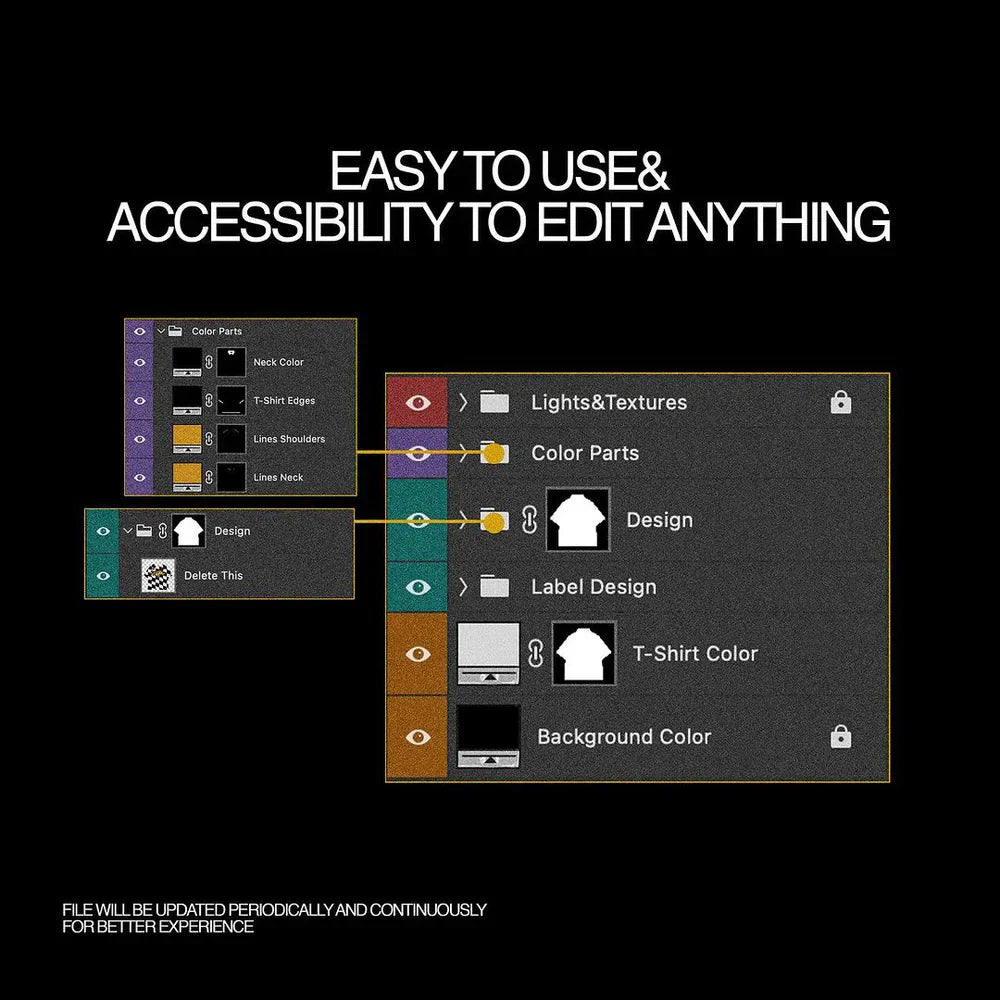
PREPARE THE MASTER FILE (SIMPLE, CLEAN, REVERSIBLE)
Open the mockup and identify the Smart Objects (editable areas), shadows and highlights (volume layers), and the textile’s mesh texture. Convert any new visual to a Smart Object before transforming it: this allows you to adjust without degradation. Use masks to blend cutouts, never the eraser. The blending modes Screen, Overlay, and Linear Dodge (Add) are sufficient for most reflections; lower the opacity before changing modes if it's too intense. This clean workflow makes the file forgiving and lets you revert if a sponsor changes or the collar evolves. (General Photoshop principles.)
POSITION LOGOS, BADGES, SPONSORS, AND PATTERNS WITHOUT ERRORS
First, place the jersey base (color/pattern), then the hierarchical elements: club crest, kit manufacturer logo, main sponsor, sleeve badges, then details (shoulder stripe, piping, micro-graphics). Respect the "breathing room" around brands: avoid placing sponsor and crest too close together. If you're working for actual competition, regulations vary by league and competition: UEFA precisely frames the size/area of sponsors, badges, title stars, etc. To stay compliant, check the UEFA Equipment Regulations (2024), for example, the article on sleeve advertising (max surface 100 cm², max height 12 cm). The same principle applies to numbers and names, referenced in dedicated chapters. For an amateur club or a brand, keep these ratios as safeguards for legibility and visual ethics.
NUMBERS, NAMES, TYPOGRAPHY: AUTHORITY COMES FROM LEGIBILITY
Create an invisible grid: central chest axis, pectoral horizon line, and a "no-fly" zone around the collar/zip. Names are placed straight, without excessive arch (unless tradition dictates), numbers remain contained with a safety margin above the hem. In competition, numbers and names are standardized by equipment regulations (FIFA/UEFA); in brand/fashion, mirror these proportions to maintain the "football" aesthetic and camera legibility.
ADD RELIEF: MESH, FOLDS, AND CREDIBLE DEFORMATION
A convincing jersey requires a credible mesh texture and folds. On a clean mockup, the mesh is already included; subtly enhance it with an Overlay layer at 10–20% if your solid color appears too "flat." To make a pattern conform to the volume (diagonal stripe, chest graphic, checkerboard), use Puppet Warp or Mesh Warp within the Smart Object, not on the final mockup layer, to retain the ability to adjust the design without recreating the effect. A hint of fine noise (1–2%) on very clean areas brings the material closer to a photograph. (Standard Photoshop methodology.)
SUBLIMATION, FLOCKING, SCREEN PRINTING: MATCHING MOCKUP AND PRODUCTION
If your mockup is to serve as pre-production, adopt actual printing standards. For sublimation (all-over jerseys), many workshops accept 150–300 DPI files depending on the template; sublimation handles 150 DPI at actual size very well, especially on fabric, but goes up to 300 DPI for small details/monograms. For DTG/Transfer, aim for 300 DPI on the printable area provided by the service provider. Stay in sRGB for web and most POD workflows, unless the printer requires a specific CMYK profile. Always keep bleed (background extending beyond the trim) and a safe area (area where text/logos should not touch the template edges).
EXPORT CHECKLIST: CLIENT PRESENTATION, WEB, OR TECH FILE
For presentation: export in sRGB PNG (transparency possible) at 2000–3000 px height, and a light JPEG for email. For e-commerce: 1600–2400 px on the long side, consistent plain background, descriptive filename (e.g., jersey-football-home-2025-hytrape.png) and readable alt tag (“Home Jersey 2025 – diagonal pattern – front view”). For tech pack: PDF with visible layers (or full-size 300 ppi images), plus a “flat” visual without shadows to show construction. If printing is planned, also provide the printer’s template version, even if your mockup is validated. (Usual POD/printing export best practices.)
STEP-BY-STEP WORKFLOW (BEGINNER → PRO)
-
Base: Open JERSEY FOOTBALL FREE, replace the color with your club shade or brand palette via a Hue/Saturation layer or a Fill within the Smart Object. 2) Crest & sponsor: Import as SVG/high-definition PNG, convert to Smart Object, adjust size respecting margins. 3) Patterns: If applying an all-over pattern, check the seam alignment and reduce contrast on folded areas. 4) Mesh & shadows: Keep the mockup’s native shadow layers; if enhancing the mesh, remain subtle. 5) Back view: Arrange name and number with a simple grid, align number height to the shoulder blades rather than the collar. 6) Variants: Duplicate the PSD and create three consistent colorways (home/away/third). 7) Export: A “hero” version for the page, a “flat” for the technical sheet, an optimized thumbnail for social media. You remain fast, reversible, clear.
READY-TO-USE RESOURCES (TO LINK ON YOUR STORE)
Download JERSEY FOOTBALL FREE to prototype immediately and cleanly showcase front/back. If you want to go further in staging (lookbook spreads, e-commerce landing page, mini-catalog), add +50 ULTIMATE MOCKUP BRAND PACK to multiply angles and supports. And if your art director leans street/oversize, Jersey Mockup Oversize PSD [By Züli] will provide that ample drape that appeals to current fashion. All three work well together: free for quick starts, “brand pack” for selling, oversize for collections.
LEGAL & COMMON SENSE: USING IDENTITIES WITHOUT RISK
Avoid using real brands/crests without authorization in your public examples. For an amateur club, create an original identity; for a tender, mask any unauthorized third-party brands. Regarding competition, UEFA/FIFA regulations govern numbers, names, badges, and advertisements; even if you're doing speculative design, drawing inspiration from these standards protects legibility and brings you closer to a "credible matchday" rendering.
SMOOTHING THE DETAILS THAT MAKE IT LOOK REAL
Avoid “luminous sponsors” that burn the image: a sponsor should appear printed into the material, not pasted on top. Locally adjust the light integration with a soft curve and, if necessary, add an ultra-blurred 1–2 px drop shadow with very low opacity to adhere to the textile. Collars (V-neck, round, polo) call for slightly different placements: with a deep V-neck, move the sponsor up 2–3% of the height to maintain visual balance. If you add a shoulder stripe or trim, keep it symmetrical and zoom to 100% to ensure constant thickness on curves (mesh warp within the Smart Object).
FROM PRESENTATION TO PRODUCTION: THE NUMBERS THAT AVOID REVISIONS
For all-over sublimation: work with the printer's template, aim for 150–300 DPI depending on detail, stay in sRGB if requested, and respect the indicated safe zones. For DTG/Transfer: 300 DPI on the printable area, background removed if necessary (PNG), and an alignment test before mass production. For a client deck or Shopify page: long side 1600–2400 px, sRGB, explicit filenames, descriptive alt texts. This combination gives you a clean rendering on the website, in PDF, and in mobile review without re-editing your exports three times. (help.subliminator.com)
TO GO FURTHER, WITHOUT OVERCOMPLICATING THINGS
If you want to simulate a breathable material like ventilation mesh, add an ultra-light film grain pass only in non-sponsored areas. If you want a more "fashion" look, tilt the light diagonal by about ten degrees and reinforce the shoulder pad with a local micro-contrast; the sponsor must remain legible to the naked eye on a smartphone. If you're creating women's or youth versions, remember to adjust the logo proportion relative to chest width (don't identically transpose a "men's" placement onto a narrower cut). The golden rule remains: typography leads, material accompanies, the mockup fades behind the idea.
IMMEDIATELY USABLE SUMMARY
Download JERSEY FOOTBALL FREE to get started. Establish a clean base and prioritize: crest, kit manufacturer, sponsor, badges, then details. Add relief subtly: mesh, folds, soft masks. Base your placements on UEFA/FIFA guidelines for a "match-ready" look, even outside of competition. If for production: 150–300 DPI depending on the process, sRGB if no CMYK profile is required, bleed and safe area respected. When you want to sell the concept, stage it with +50 ULTIMATE MOCKUP BRAND PACK; if you're talking fashion, Jersey Mockup Oversize PSD [By Züli] will do the rest. You'll go from idea to credible visual without getting lost in technicalities, and that's exactly what a good mockup should deliver.
Share: