




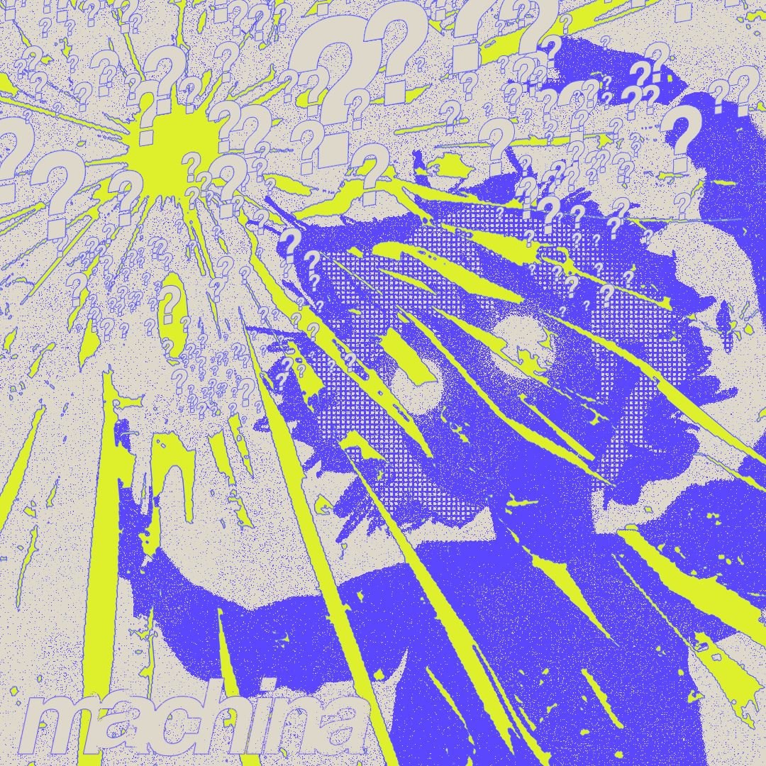
TIKTOK-READY SINGLE COVER: THE BEST ALBUM COVER TEMPLATE TO BOOST YOUR STREAMS
You can drop an 808 that shakes the chest, write lyrics that stir the soul, have a topline that sticks in your head for three days. If your cover doesn't stop the scroll in the first 0.5 seconds, no one will listen. This is the truth of the current market: the ear comes after the eye.
In today's French rap (drill, Jersey club, hybrid trap, R&B club nightlife), the cover is no longer just a pretty square image to send to Spotify. Your cover has become: the announcement poster for your release, the most reposted slide of your story, the YouTube thumbnail of your upload, the visual for live events, and sometimes even the merchandise argument printed on a tee shirt on the night of your first concert.
In other words: your cover is your first commercial argument. It is your compressed branding. And if you treat it like a decoration, you're shooting yourself in the foot.
This text will show you why your cover is a weapon, what emotional story it should tell, how the algorithm reads your cover (yes, literally), and how to create a consistent and exploitable visual identity everywhere with a ready-to-use template: DIY COVER BUILDER. We'll also talk about "buffer" details, those micro-visual signatures (title font, "Parental Advisory" label, composition) that make people believe you already belong to a real structure, even if you're still working in your bedroom.
WHY YOUR COVER IS YOUR PASSPORT
Previously, a cover served to feature a face or a stylish visual to appear in playlists. Now, the cover serves to tell a story before the listening experience. The audience doesn't just want to hear a track. The audience wants to enter an emotional universe. When we say "emotional universe," it's very concrete: are you jealous, in love, cold, violent, paranoid, romantic, obsessed with loss, obsessed with revenge, obsessed with your appearance, obsessed with your loyalty?
This emotional positioning must be felt in one second. This is exactly the visual role of the cover. It must summarize your DNA as if you were already a brand.
Serious emerging artists are already doing this. They don't release a sound, they release a season of their personal series. Each release is scripted like the next episode. Key phrases reappear. Colors reappear. Symbols reappear. Visual codes become emotional landmarks for the audience. Result: people become attached, not just to the track, but to your mythology.
So it's not "just an image." It's your flag. It's your war banner. It's your aura.
HOW THE ALGORITHM READS YOUR COVER
We're not talking about black magic. We're talking about human behavior.
On TikTok or Reels, if you announce a song, the first frame is often your cover or a crop of your cover. If it pops, if it intrigues, if it exudes a real identity (not a blurry background + Arial text), the viewer stays an extra second or two. An extra second or two is huge. That's what determines whether the algorithm will push it or not.
On YouTube, the thumbnail is step zero. It's literally the movie poster. No one has time to read the 3 lines of description. The cover MUST already tell a world. It must say: "This thing is important to someone. It's not just a random freestyle posted at 3 AM, it's a chapter."
On Spotify and Apple Music, your cover will appear in a tiny square. People will see a block of color, a shape, typography. If it's clean, if they sense seriousness, you get a curious click. If it looks like a quickly retouched Snapchat capture, you lose that click. In an economy where you're paid per stream, losing a click means losing money.
BUILDING YOUR COVER WITH A PROFESSIONAL TEMPLATE
This is where DIY COVER BUILDER comes in:
The pack is not just "a pretty PSD." It's a system. Inside, you have three ready-made and calibrated formats:
– The square single cover (streaming platforms).
– The vertical story format (TikTok / Reels / Insta Story).
– The horizontal banner (YouTube header, announcement, Facebook event, ticket visual).
You work ONCE. You export THREE TIMES. Result: your identity remains consistent everywhere. This detail – visual coherence between story, thumbnail, cover – is literally what makes the difference between "isolated artist who posts" and "creative entity launching a campaign."
You want the public to feel: "This release was thought through. We can invest in it emotionally." Even if it's just you behind the screen.
CHOOSING YOUR EMOTIONAL PALETTE
Before even adding effects, you need to answer one question: what is your song about, but not in words – in feeling?
Jealous love.
Icy pride.
Loneliness.
Toxic desire.
Revenge.
Safe place with the crew.
Sweet hate.
Missing someone.
Drugged/slowed/suffocated state.
Club moment, sweating, glowing skin.
You choose ONE dominant feeling. Then you build around it:
The main color
Threatening red (anger, danger, impulse).
Midnight blue (nostalgia, melancholy, hurt).
Glossy pink (sensual obsession, seduction, intimacy).
Toxic green (jealousy, paranoia, possessive impulse).
Concrete gray / cold steel (survival, isolation, hardness).
The visual texture
Liquid chrome.
Dirty photocopy grain.
Leaking neon club light.
Wet skin, glints on forehead and cheekbones.
Scanned crumpled paper.
The totem symbol
This is the object or motif that will be remembered about you. A mask. A pierced heart. A key. A stylized weapon. A pendant. A hand. A halo. This symbol must be able to reappear on a t-shirt, on a banner, in a story. It becomes your emotional logo.
It's this totem that allows the public to say "that's him / that's her" without even reading the name.
POSITIONING THE SONG TITLE AS A SIGNATURE
Classic beginner's mistake: lost micro-font, or huge cheap text that overwhelms everything.
Your title must meet three criteria:
Readable in miniature.
You must be able to read it when the image is reduced to thumbnail size on a phone.
Visible where the eye naturally lands.
Generally bottom-center or bottom-left, not too close to the edge. The human eye scans these areas first on a square clip.
Credible typographic treatment.
You want lettering that looks "official," not just a simple black Arial on the model's shoulder.
That's exactly why we have the TITLE TREATMENT FONT PACK: The pack gives you professional title treatments with pre-composed fonts like on real covers that you can integrate directly. You don't spend three nights on the shape of the letters. You plug in an identity that already has the scent of a "serious release."
BADGES THAT LEND CREDIBILITY TO YOUR COVER
Have you noticed something? When you see "Parental Advisory," your brain reads "real song, real release, real danger." It's irrational, but incredibly powerful.
The PARENTAL ADVISORY VARIATIONS pack is designed precisely for this. It gives you reworked variations of the cult label: dirtier, more luxurious, more minimal, more ironic. You place it at the bottom of your cover. Instantly, you change the perception: you are no longer "someone trying." You are "someone releasing something important." The packaging already communicates the value of the content.
This step is psychological, but it has a direct effect: people are more likely to share a cover that looks like a "real cover." They repost it in their story. They use it as a temporary wallpaper. You enter their phone = you enter their intimacy. This is the beginning of the cult.
BUILDING A VISUAL CAMPAIGN, NOT JUST AN IMAGE
Why the multi-format bundle is non-negotiable today:
You don't have the luxury of improvising visual by visual. When you change your image too much between Spotify, YouTube, TikTok, and Insta Story, you blur the message. People don't internalize your identity. You remain "one sound among others." You don't rise to the rank of "person to follow."
With DIY COVER BUILDER, you directly output three clean formats:
– square for audio platforms,
– vertical for story / TikTok teaser,
– horizontal for event banner.
That alone changes how people talk about you. You look structured. You look serious. You look ready to defend your universe.
This is not a matter of visual ego. It's a matter of business. A clear identity is more shareable. A clear identity is more memorable. A clear identity converts curious people into listeners, and listeners into people who buy tickets / merchandise, more effectively.
Stop seeing your cover as an illustration. Start treating it as a cornerstone of your personal economy.
Your cover is:
– your visual halo,
– your emotional passport,
– your movie poster,
– your entry point into the imagination of others.
You don't need to wait to be signed. You don't need to be rich. You just need to be intentional.
Make your cover your first act of power. The sound will come after, the audience too.


Share: