2026 DESIGN TRENDS: COVERS & POSTERS, KINETIC TYPE, GLASS, LIQUID METAL, RISO)
2026 doesn't demand more effects; it demands more legibility. Posters and covers that work in a feed and on a wall share the same promise: a strong idea, credible material, and controlled visual rhythm. New "fashions" are merely grams added to this grammar. What truly changes is how light is allowed to breathe, how texture is anchored, and how typography is written to be vibrant without shouting.
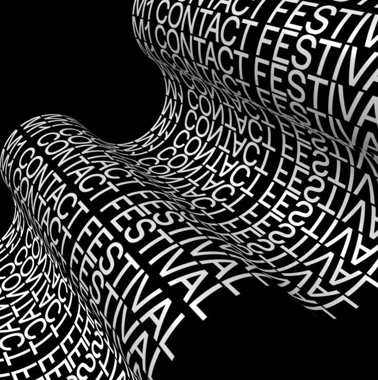
Kinetic typography asserts itself without confusion:
Variable, it transitions from condensed to extended in a legible, not theatrical, movement. We're talking about a word that "takes up space" at the right moment, then fades to make way for the image. On a cover, this micro-movement replaces the stacking of effects. In static form, kinetics are mimicked by a gradient of thickness, a slight directional blur, and an alternation of weights. The eye first reads the meaning, then the prowess.
Glass returns, but polished. The era of ostentatious refractions is over; 2026 favors precise glints, localized in areas of contrast (logotype, subtitle, visual corner). The secret isn't "brilliance"; it's the shadow bordering the reflection. A poster presents three levels: a very subtle textured background, a crisp subject, and a single controlled glass zone. The result: an image that looks expensive without being gaudy.
Liquid metal becomes an alphabet, not a filter. A liquefied 3D form is treated like a sculpture: soft lateral light, light drop shadow, interaction with the type (mask, overlap). A single well-lit liquid object is better than a background saturated with waves. The poster gains presence because the object has "substance," not because it occupies half the page.
The analog revival is being cleaned up. Riso, film grain, dust... all already exist in abundance, but 2026 emphasizes precision: cleanly photographed 300 DPI paper, fine halftone screen controlled by density, softened "photocopy" edges. We no longer "hide" a weakness; we anchor a strong image in credible material. The viewer feels the hand, without seeing the trickery.
Regarding the palette, minerals dominate. Ivories, deep blacks, stone grays, grayish blues, punctuated by a rare metallic or electric accent. This color restraint clarifies the hierarchy: the sign leads, the material supports, the accent seals the memory. In music, it's the equivalent of a clear hook held by a sober rhythm section.
Recipes that hold up in production follow a simple line. An effective composition is built in three layers:
Textured background (riso/paper/very fine noise), subject or sculpture (photo, 3D, crisp illustration), authoritative typography (contrasting serif + humanist sans).
Between these three masses, we create breathing room:
Honest margins, regular leading, consistent body. Export is done in sRGB for web (2000 px long side) and 300 ppi for print, with black control to avoid crushing.
"Downloadable files" become more useful when targeted
A master PSD with named layers, a set of masks for refractions, three non-destructive halftone presets, and two 300 DPI paper textures are enough to fuel a series of posters. The idea isn't to give everything: it's to provide the pieces that accelerate, without confining.
Hybrid workflows are becoming standard:
An AI base can be used to explore typographic morphologies or liquid 3D volumes; refinement is done in digital painting, and material anchoring through photographic textures. Provenance is not a gimmick: documenting the itinerary (sketches, versions) reassures the client and allows for rapid iteration.
A successful cover tells a story at first glance, then delights at second. A poster holds up from afar, then rewards up close. What seemed "over-designed" yesterday tires in 4 seconds; what seems simple but alive imprints itself on the mind and is shared. 2026 trends reward substance more than exuberance.
HYTRAPE Resources to link (varied, adapted to 2026 recipes):
GLASS PACK — TRANSPARENT GLASS SHARDS for realistic non-destructive reflections.
3D LIQUID CHROME SHAPES (PNG/OBJ) for credible liquid objects to illuminate.
RISOGRAPH INK TEXTURE KIT for riso inks, fine smudges, organic screens.
FILM DUST & SCRATCHES — 4K TEXTURES for clean, controllable analog grain.
MAGAZINE & POSTER MOCKUP SET for crisp editorial scenes (flat, 3/4, inner pages).
COLOR LUTS — CINEMATIC NEUTRALS to harmonize the palette in a coherent pass.
Share: