THE RETURN OF THE "DARK": CULTURAL CONTEXT, CREATIVE OPPORTUNITY
Occult textures in motion: from print to motion, an aesthetic that breathes
Black is back because it soothes the noise. The visual culture of 2025 is shifting towards more narrative, more textured images, where darkness serves as a frame for light. This is not a simple gothic revival: it is a grammar of contrasts and signs. Trend reports highlight a dual movement, between escapism and anchoring, which gives way to controlled strangeness, symbols, and a reinvented medieval aura. We speak of imaginary "escapism," surreal visuals, living materials; in short, an ideal ground for a contained occult aesthetic that breathes instead of saturating.
FUTURE MEDIEVAL, CONTEMPORARY GOTHIC: WHY IMAGERY ENDURES
From the studio to the runway, medieval and gothic iconography is making an unironic appearance. Editorials and reference columns describe this "future medieval" as a transversal language: slender silhouettes, muted gilding, stylized crests, and authoritative typographies. In fashion, the season has shown black and baroque signatures, corsets and veils, Byronesque silhouettes; both mainstream and professional press confirm a deep wave, not a seasonal gimmick. For design, this is a signal: the eye again accepts density, provided it is legible and consistent.
BASIC VOCABULARY TO START WITHOUT CLICHÉ
It all starts with the right words. "Occult" does not mean proselytism or Halloween folklore: it is a symbolic foundation, a reservoir of signs—hands, eyes, runes, allegorical creatures, cabinet of curiosities engravings—treated as visual punctuation. We move beyond decorative accumulation to enter into syntax: a totem near the title, a subtle counterpoint in the background, a diagonal of light that guides the eye. Creative platforms and reference blogs observe this: dark universes work when they tell something specific, with a hierarchy of planes and controlled textures, not when they stack symbols.
MATERIALS AND PALETTES: PUTTING LIGHT TO WORK
Work the material before the effect. The combination that holds, in print as well as in motion, brings together a fine "photocopy" grain, a soft halftone, a light paper patina, and a clean engraving line. The palette is parsimonious: black ink, ivories, subdued burgundy, oxidized greens, aged metal. Design trends for 2025 point to this need for sensitive textures and affirmed minimalism—few elements, but carefully chosen and held. In practice, this visual calm protects typography, facilitates animation, and better survives social compressions.
AUTHORITATIVE TYPOGRAPHIES: PROMISE AND DELIVER
A distinctive serif lends authority to the title, while a humanist sans serif conveys the endurance of information. Line spacing creates a halo around the totem, and the grid remains simple to become the "memory" of the series. In terms of trends, dark universes favor clear typographic contrasts: a structured large capital at the top, calm secondary text, and sparse initial letters. The result is less spectacular than effective: you first understand where to look, then what you are looking at. It is this rhythm that distances kitsch.
MOTION DESIGN 2025: LEGIBLE KINETICS, 2D/3D HYBRID, LIVING MATERIALS
This year confirms clear trends: letter kinetics remain a standard; the 2D/3D hybrid is establishing itself; "analog" collages and textured grains are returning because they humanize the image. The principle is simple: a legible typographic plane serves as a metronome, 3D intervenes as a micro-volume or discrete sparkle, and texture unifies the whole. Reference sources converge on these three pillars, whether specialized analyses or educational guides for motion designers.
TOOL PIPELINE: AFTER EFFECTS AND NATIVE 3D, WHAT REALLY CHANGES FOR YOU
In terms of tools, a concrete shift has occurred: After Effects now imports 3D models in GLB/GLTF and OBJ formats and renders them in the same 3D space as AE cameras and lights. This is enough to integrate a discrete volume – a seal, amulet, ring – without leaving your 2D pipeline. Official fact sheets and professional summaries confirm the time savings: no more need for third-party plugins for a simple volume, better light/type coherence, clean retiming of embedded animations. You gain in rapid iterations and rendering fidelity.
FROM STILL PAGE TO CLIP: A SINGLE MASTER FILE
The secret to an occult universe that holds true in both static and motion is the uniqueness of the source. Build a clean master document: engravings as smart objects, textures as adjustment layers, live vector typography. In motion, you reuse the same elements in the timeline; the light-typography hierarchy remains the compass. Motion trends confirm that this "lightening" of the pipeline—fewer apps, more reuse—is what makes the approach realistic for small teams.
AVOIDING KITSCH: THREE COMMON MISTAKES, THREE SIMPLE CORRECTIONS
Cliché begins when the image confuses density with confusion. First mistake: stacking symbols and textures without hierarchy; the correction is to choose one totem, two supports, and let some black breathe. Second mistake: sacrificing the lettering; the correction involves a "corridor" of legibility and soft masks over the highlights. Third mistake: decorative "glitch"; the correction is controlled perturbation at the edge of the frame, serving a transition or a narrative pivot. This discipline aligns with trend reports: 2D/3D hybrid, letter kinetics, and the return of "living" textures only win if they serve meaning.
BEGINNER SCENARIO: DOING IT WELL, SIMPLE, FAST
You open an sRGB document, place an engraving, install a very light "photocopy" texture, and draw a diagonal of light. You leave a halo around the title and check legibility when scaled down. Then you move into motion: a breath of gilding on the totem, a micro-deformation of the letter, a light breath precisely timed per second. The goal is not to add effects, but to build a path of attention. The 2025 design guides emphasize this "bold minimalism" legibility: few elements, very well maintained, that withstand social compressions.
PRO SCENARIO: FINER, NOT HEAVIER
You keep the same framework, but you refine it. Two halftones with different frequencies to separate background and totem. A soft displacement map to make a line "pass" behind a virtual pane of glass. A micro 3D volume for a ring or a seal, integrated into After Effects without leaving the project. And, above all, letter kinetics regulated like a tempo: the animation writes the meaning, not the other way around. The interest of 2025 is not technological extravagance, but pipeline realism: more native 3D when needed, more textured analog when it's right.
HYTRAPE RESOURCES: BUILDING A LEXICON, ESTABLISHING MATERIAL, ACCELERATING MOTION
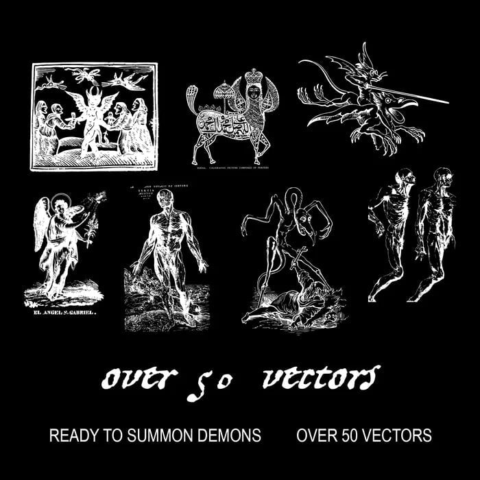
Start with +50 SECRET CACHE — OCCULT DRAWINGS. These high-definition engravings provide a precise vocabulary: hands, eyes, symbols, stylized creatures, and clean lines that hold from mobile to large format. They integrate into print, can be masked in motion, retain their sharpness, and support micro-volumes around them.
Continue with HALFTONE CREATIVE PACK, THE ANALOG HALFTONE MAKER and PHOTOCOPY CREATIVE PACK. The goal is not to "dirty" but to unify: a soft halftone for the background, a photocopy noise for the page's skin, a light granularity that calms everything and brings the image closer to a real object. Motion trends cite this return of living materials, precisely because they humanize AI-saturated visuals.
Add GLITCH MAPS and GFX KIT as spices, not as the main dish. Use displacement maps at the edges to signal a passage, a breath, a fault; never to cover the letter. Finally, finalize your variations in consistent mock-ups from a clean BRAND PACK: the light, textures, and typography will maintain the same logic from poster to packaging, from thumbnail to animated post.
PALETTES AND MATERIALS: WHAT REPORTS SAY, WHAT WORKS IN PRACTICE
The 2025 summaries highlight a taste for metals, grains, "textured grains," an affirmed sobriety in staging, and a persistent attraction for gothic and medieval imagery. These trends make sense with the occult aesthetic, provided the composition is anchored in directed light and a restricted alphabet. A master color duo, a metallic accent, a deep black set at the end of the chain: the image breathes, the brand holds, the gaze is guided.
EXPORTS, FORMATS, QUALITY CONTROL: THE PART THAT MAKES THE DIFFERENCE
For the web, stay in sRGB; for print, only convert to CMYK if the printer requests it, and according to their ICC profile. Prepare a high-definition base, adapt your social formats to 1080×1350 (4:5) and check legibility at 100% display. In motion, prioritize clean intermediate files and let the platform recompress: it's not the race for dBs and "glows" that wins, it's the stability of your visual hierarchy. Motion guides for 2025 reiterate: typography in motion tells the story; the rest serves the story.
Show a calm variation: a dark poster, then its animated version revealing gilding, a slight relief on a 3D seal imported as GLB, a hint of glitch at the edge. The user understands that the same idea lives across multiple media, without makeshift solutions. The occult aesthetic becomes an invitation, not a disguise. This is where HYTRAPE resources make a difference: they offer consistent material that traverses formats, accelerates production, and protects the signature. Trends, from fashion to design, confirm that this medieval, gothic, symbolic language does not go out of style when it remains legible and embodied.
IN ONE SENTENCE, THE METHOD THAT HOLDS FOR THE YEAR
Choose a totem, illuminate it with restraint, protect the letter, unify with a soft texture, animate with breaths and micro-volumes. Rely on +50 SECRET CACHE — OCCULT DRAWINGS for the lexicon, on HALFTONE CREATIVE PACK, THE ANALOG HALFTONE MAKER, and PHOTOCOPY CREATIVE PACK for the skin, on GLITCH MAPS and GFX KIT for controlled thrill, and keep a clean BRAND PACK to diversify without losing track. This is not a passing style, it's a way of ordering light—and making an imagination endure that whispers more than it thunders.
Share: