


Tadao Ando: Understanding His Architecture of Concrete and Light
Church of the Light, Chichu, Water Temple and Bourse de Commerce: understanding Tadao Ando, his spatial sequences and his light, with sources and an FAQ.

Tadao Ando is a Japanese architect whose buildings combine simple geometries, exposed concrete and carefully framed light. Winner of the Pritzker Prize in 1995, he has designed houses, places of worship and museums. His work is best understood not as a collection of gray walls but as a succession of passages: from the city to a courtyard, from shadow to an opening, from the landscape to a room. To discover this architecture, here are its principles, several landmark buildings and a method for telling visual admiration apart from the real experience of a place.
Who is Tadao Ando?
Born in Osaka in 1941, Ando was largely self-taught, shaped by reading, travel and observation. His Pritzker Prize biography documents this path as well as his international recognition. The point isn’t to turn him into a legend of solitary genius: making a building takes a team, a commission, studies and extremely precise execution. Exposed concrete, in fact, makes many of these demands visible.
To approach his work, keep three questions in mind. What path prepares the arrival? What geometry gives the place its coherence? What does the light reveal over the course of the day? These questions work better than an inventory of materials. They also help explain why two buildings that both use concrete can create opposite experiences. A shared material isn’t enough to produce calm or to define minimalist architecture; proportions, uses and transitions remain decisive.
Exposed concrete: a surface that reveals the construction
In Ando’s work, concrete can be structure, boundary and finished surface all at once. The formwork joints and tie holes give the wall a sense of measure. This presence depends on the preparation and care brought to the construction site. It can’t be reproduced simply by choosing a gray paint. The perceptible result comes from a combination of decisions about form, junctions, openings and the relationships between elements.
When you look at a wall, observe what happens at its edges: how does it meet the floor, what becomes of it at a doorway, what shadow does its thickness cast? A frontal photograph can make these questions disappear. An oblique detail, on the other hand, reveals the materiality. In a personal project, you can take away this discipline of junctions without trying to copy the material. A shelf, a page layout or an object will sometimes gain more from a coherent joint than from a spectacular effect.
The Church of the Light: an opening that organizes space
The Church of the Light, in Ibaraki, Japan, is one of the best-known landmarks of his work. The luminous cross is instantly recognizable, but you also need to observe the relationship between the enclosed volume, the entrance and the direction of the gaze. The light acts as an element that transforms how the wall is perceived and gives the space a center.
Don’t reduce the project, though, to a graphic sign detached from its religious use. For an analysis, distinguish the actual opening, its photographic image and its symbolic value. The framing of a photograph conveys neither the acoustics, nor the temperature, nor the time spent inside. If you’re putting together a reference board, add a view of the circulation or a description of the route through the building. You’ll get a richer reading than by repeating the same frontal framing, even when that framing seems to sum everything up.

Chichu: bringing daylight into a buried museum
On Naoshima, the Chichu Art Museum brings architecture and the presentation of artworks together in a close relationship with the site. The official Chichu Art Museum website explains the choice of a mostly underground museum and the use of natural light. This relationship with the landscape changes the usual question of the iconic museum: the building doesn’t simply offer a silhouette to photograph from the road.
To understand the idea, imagine your route in section. The ground, the sky and the openings become reference points as important as the facades. A buried space can be oriented by light rather than by a distant view. This observation also invites you to distinguish an architectural concept from the conservation constraints specific to the artworks. You can’t conclude that every exhibition would benefit from direct sunlight: the program, the materials on display and the presentation conditions change the answer entirely.

The Water Temple: the landscape as threshold
The Water Temple, on Awaji Island, shows another way of composing an arrival. The pond and the passage toward an interior space shift attention from the isolated building to a sequence. The architecture is discovered through the body and over time, not only through the exterior view that would make it instantly recognizable.
This example is useful for learning how to document a visit. Photograph the approach first, then the threshold, then the change of level. Note what becomes invisible and what gradually appears. Your account can then explain a shift in perception instead of stringing adjectives together. This approach also distinguishes the calm a project aims for from the calm actually felt in a given situation: crowds, season, noise and light can all change the experience. An architectural intention doesn’t guarantee the same emotion for every visitor.

In Paris, the Bourse de Commerce brings two eras into dialogue
The transformation of the Bourse de Commerce for Pinault Collection inserts a contemporary cylinder into a historic building. The interview published by Pinault Collection presents Ando’s intention: to let the building’s past coexist with a new experience. The project should be credited to his collaboration with the restoration and design teams, rather than imagined as an intervention without a heritage context.
The contrast is particularly instructive for a non-specialist eye. On one side, the decor and the dome carry a visible history; on the other, a sober surface reorganizes distances and movement. You can then look at how the new frame makes you see the old. The City of Paris presentation offers another, institutional perspective. To prepare a visit, check current conditions with the museum; the works on view, access and available spaces may change, while the architectural principle remains.

Ando, brutalism and minimalism: categories that need defining
Exposed concrete visually links Ando to certain brutalist buildings. But brutalism has a history that also involves constructive expression, public facilities and social positions. Using the same material isn’t enough to place every work in the same movement. Minimalism, for its part, often describes a reduction of visible means, without on its own explaining the program or the construction.
Our John Pawson feature offers a useful comparison. Look at how each treats the threshold, proportions and surfaces, without trying to crown a winner of the “most minimal.” A white room and a concrete room can both be complex. For your own analysis, first describe a specific spatial mechanism: an indirect entrance, a high opening, a sheltering wall or a courtyard that lets the whole breathe. You’ll then be able to use the categories more accurately.
HYTRAPE exercise: working with light rather than the concrete effect
For a fictional music cover, create three studies from a photograph you hold the rights to. In the first, isolate a light source; in the second, crop to create a zone of silence; in the third, place the title where it creates tension with that light. Only add texture after checking the composition in black and white.
HYTRAPE’s covers and posters guide provides a bridge to graphic design. The goal isn’t to attribute an album design method to Ando, but to translate a spatial observation into a visual decision. A margin can act as a transition; a shift in contrast can guide the eye. Finally, test your composition as a thumbnail. If the text becomes illegible or the light overwhelms the whole image, scale back the effect before adding any further decorative elements.
How to look at an Ando work without oversimplifying it
Prepare a short fact sheet with the location, the function, the identified contributors and two complementary views. Look for an attributed plan or section, then check that your description really matches the building named. Images of temples, churches or museums sometimes circulate with loose captions. A beautiful but misattributed image makes a bad reference, even if the atmosphere seems perfectly consistent.
On site, give time to the passages. Look at the sky from a courtyard, come back to a shadow and observe a junction instead of rushing to the famous shot. For editorial work, separate facts from interpretations: an architect’s name or the year of a prize can be verified; a sense of serenity should be described as a personal experience. It’s this combination of documentary precision and sensitive attention that lets you understand Ando beyond an instantly recognizable aesthetic.
Frequently asked questions
Who is Tadao Ando?
A Japanese architect born in Osaka in 1941, known for his geometries, his exposed concrete surfaces and the way he composes with light. He received the Pritzker Prize in 1995.
Which Tadao Ando building can you see in Paris?
The Bourse de Commerce houses an intervention by Ando carried out with design and restoration teams. Its contemporary cylinder is in dialogue with the historic building.
Is Tadao Ando a brutalist architect?
His use of concrete invites visual comparisons, but brutalism has a specific history. It is more accurate to describe the devices of each project than to infer a movement from the material alone.
What is the difference between Chichu and Teshima?
The Chichu Art Museum was designed by Tadao Ando. The Teshima Art Museum brings together architect Ryue Nishizawa and artist Rei Naito. They are two different projects.
Further reading in the HYTRAPE Journal
- Japanese architecture: principles, houses, temples and museums
- Le Corbusier: the five points and four buildings to understand them
- John Pawson and minimalism
Sources and method
Sources consulted on October 29, 2026. Historical facts and attributions are based on the references below. The reading methods and creative exercises are HYTRAPE’s editorial analysis. The exercises are fictional; they are not architectural projects carried out by HYTRAPE.
HYTRAPE shop · Free Resources
Put your reading into practice.
A Free Resources selection from HYTRAPE’s independent creators.
-
 HYTRAPE x ATTRACT VISUAL
+10 BROKEN GLASS TEXTURE (FREE)
Free
-
 HYTRAPE x ATTRACT VISUAL
+100 HD TEXTURE PACKS (FREE)
Free
-
 HYTRAPE
BERRIE FONT (FREE)
Free
-
 Fox Rockett Studio
Surface Supply Texture Pack
Free
-
 HYRO(IC)
+35 HYROIC / HYRO(IC) FREE sample pack
Free


20,000+ downloads 4.7/5 45 verified reviews
Keep reading
ARCHITECTURE
Adaptive Reuse in Architecture: Four Projects and the Right Questions
Tate Modern, Frac Grand Large, SESC Pompéia and Lacaton & Vassal: understanding how existing buildings are transformed, their uses and their trade-offs.
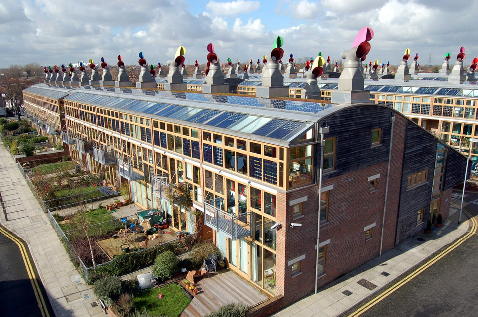
Bioclimatic Architecture: Principles and Summer Comfort Explained
Orientation, shade, ventilation, insulation and thermal mass: understanding bioclimatic design, with examples, official sources and an FAQ.
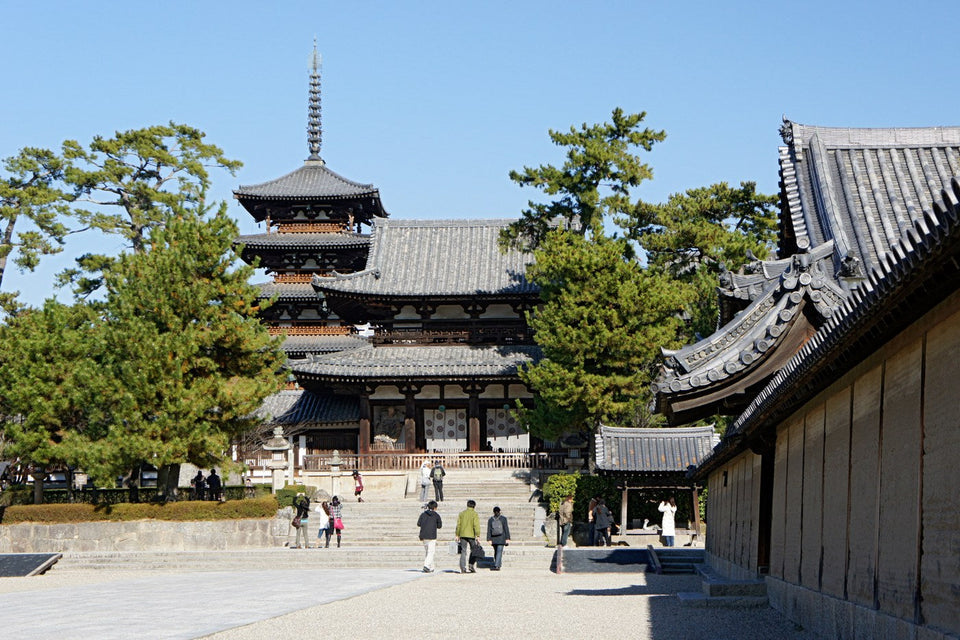


Japanese Architecture: Principles, Houses, Temples and Museums
Thresholds, wood, shoji and contemporary museums: understanding Japanese architecture through Hōryū-ji, Katsura, Teshima and Kanazawa. Images and FAQ.