




Brutalist Architecture: Definition, Buildings and How to Read Them
Recognizing brutalism: history, materials, the Barbican, Hunstanton and other examples. A method for reading buildings, with images and an FAQ.
Brutalist architecture refers to a family of buildings that make their construction legible and give their materials a direct presence. Exposed concrete is its best-known sign, but it is not enough to define the movement. A steel school can be fundamental to its history, while a smooth concrete tower may stem from a different approach. To recognize brutalism, you have to look at the structure, the circulation and the social program together. This guide offers a reading method, four built landmarks and an art direction exercise to move beyond the simple gray mood board.
What is brutalism in architecture?
The word refers in particular to béton brut (raw concrete) and to the British New Brutalism of the 1950s. Yet it brings together different approaches. The Smithsons sought a frank expression of construction; other architects then explored massive volumes, public facilities and deeply textured surfaces. The museum project SOS Brutalism points to the role of the critic Reyner Banham and to the importance of visible structure, of materials taken as they are and of a memorable image.
It therefore pays to replace the question “is it gray enough?” with three observations. Can you understand how the building stands up? Do the routes through it contribute to its expression? Do the materials show how they were assembled or put in place? These clues do not amount to an automatic certificate. They let you describe what you see before classifying a work, and they keep you from confusing an aesthetic label with a historical analysis.
The signs to look for on a facade
Start with the relationship between solids and voids. A deep balcony casts a different shadow from a window simply punched into a wall. Then look at the supports, the beams and the circulation cores: they can become the very composition of the facade. Finally, get closer to the material. Formwork imprints, aggregates and joints tell of tangible processes, sometimes far more interesting than the overall silhouette.
Photography can amplify these signs. A uniform sky, a frame with no inhabitants and strong contrast easily create the impression of a fortress. So go back to a sunny view, an entrance or a planted area. If your interpretation changes completely, you may mostly have been analyzing the photographic treatment. For a visit or a presentation, always pair an image of the mass with an image of use: a door, a bench, a gallery or a threshold.
Hunstanton: why concrete is not mandatory
Smithdon High School in Hunstanton, designed by Alison and Peter Smithson and completed in 1954, is a decisive case. Its steel structure and visible services make it impossible to reduce brutalism to a recipe of massive concrete. The Twentieth Century Society describes this vocabulary in detail, along with the alterations made to the building. It is an excellent starting point for understanding a constructive intention before it was reduced to a look.
When you look at this school, seek out the ordinary elements: frame, glazing, pipes and water tank. Their presence organizes the building’s expression. Then carry this attention over to a graphic object: an assertive grid, a clear table of contents or visible numbering can produce a comparable frankness. This is a design analogy, not a proven historical lineage between the school and any particular contemporary website. The useful principle is to show the organization rather than covering it with effects.

The Barbican: reading a city rather than an object
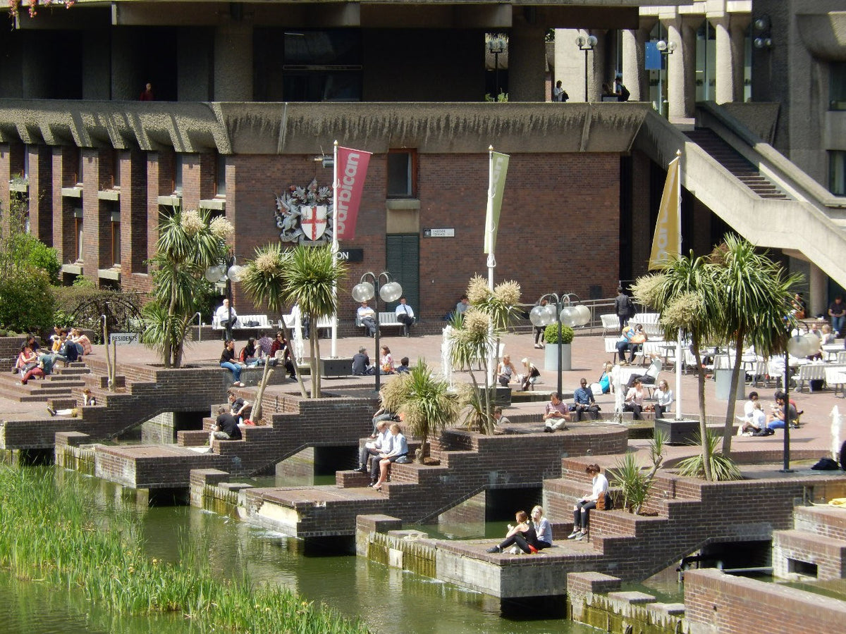
In London, the Barbican by Chamberlin, Powell and Bon links housing, culture, walkways and landscaped spaces. Its official website presents a complex conceived as a city within the city. Its appeal is not limited to the towers: the raised levels, the views toward the water and the transitions between facilities make up an urban experience.
On site, follow a route rather than a list of facades. Note the moment the ground rises, a view opens up, the traffic noise fades away. A building photographed on its own does not tell you how these sequences work. This reading also applies to the controversies: the quality of an image proves neither the comfort of an apartment nor how easy it is to find your way around. A sound judgment separates composition, maintenance, uses and successive transformations, instead of declaring the entire complex admirable or unlivable in a single word.

Boston and the National Theatre: two other readings
Boston City Hall and London’s National Theatre let you observe two different effects of volume. The first gives a strong civic presence to stacked masses; the second multiplies terraces and horizontal planes. Images of these buildings are useful for comparing a concentrated silhouette with a composition that unfolds as you move through it. You then need to consult the institutions’ own records to go beyond this first visual reading.
Try the exercise with a thirty-second sketch. Draw only the five main masses, then add the spaces between them. If the voids disappear from your drawing, start again. In this architecture, a terrace or a gap can count as much as a wall. To take this observation further, our Le Corbusier feature looks back at the Cité Radieuse and at a vision of housing in which the building also brings together shared facilities.


Brutalism, modernism and postmodernism: avoiding shortcuts
Modernism is a much broader set of explorations of space, technology and society. Brutalism shares part of this history without covering all of it. Postmodernism, for its part, may reintroduce quotations, signs and historical references. A massive or theatrical project is therefore not automatically brutalist. The loose use of the term on social media makes this distinction particularly useful.
A good reference caption gives the name of the building, its architect, its location and the reason it is in your selection. Write “depth of the loggias” or “structure left exposed” rather than “brutalist vibe” everywhere. This precision also lets you include debated cases without turning an interpretation into a certainty. If you compare these buildings to a contemporary creation, say which aspect connects them: material, geometry, program or relationship to the city. These connections are not interchangeable.
Why creatives keep coming back to these images
Concrete, modules and cast shadows provide powerful reference points for photography, record sleeves and posters. They produce legible scales and a tension between repetition and singularity. But a reference becomes thin when all it keeps is the desaturation. An inhabited building contains movement, colors, variations of light and traces of repair that the “dark” treatment often erases.
For an original creation, choose one specific spatial property. A series of balconies can inspire a rhythm of headlines; a vertical circulation, an editorial flow; a grainy material, a contrast with smooth typography. Don’t copy a protected photograph or a plan without checking the rights. The links between architecture and visual culture deserve as much precision as architectural attributions themselves.
HYTRAPE exercise: a poster built in layers
Here is a fictional exercise, to be done with your own images and HYTRAPE resources. Create a concert poster on three levels: essential information, lineup and practical details. Start with a version without texture. If the hierarchy doesn’t work yet, adding concrete won’t fix anything. Then set a module for the margins, the lines and the secondary blocks, and introduce a single deliberate break.
The HYTRAPE guide to covers and posters helps you think about textures and contrasts. The one on Photoshop packs can help you organize your files. Keep the texture at the scale of a printed piece and also test a thumbnail on a phone. The exercise transposes principles of rhythm and legibility; it is neither an architectural commission carried out by HYTRAPE nor proof of a performance gain for a poster.
How to prepare a visit or a reference board
Build your selection around a question: how do you arrive at the site, how does the light come in, or how does the structure become visible? Gather a plan published by an identifiable source, a general view, a detail and a scene of use. Include the dates of the images, because a restored facade and its earlier state can tell different stories. For inhabited sites, favor spaces that are open to the public and respect the residents.
Finish with a personal sentence that can be checked: “the exterior staircase makes the route legible from the street” is better than a pile of superlatives. Brutalism then becomes a way of looking at the relationships between material, community and space. This method also helps explain why its preservation is debated: preserving a silhouette, improving comfort and keeping a building in use often require separate decisions. The adaptive reuse in architecture feature explores exactly these trade-offs.
Frequently asked questions
What is brutalist architecture?
An architecture that makes its construction and its materials strongly perceptible. The movement has several distinct histories, including the British New Brutalism of the 1950s.
Does brutalism always use concrete?
No. Smithdon High School in Hunstanton, for example, shows the role of steel and of elements left exposed. Exposed concrete is common, but it is not enough to define the movement.
What is the difference between brutalism and modernism?
Modernism is a broader set of architectural explorations. Brutalism shares some of its concerns, with particular attention to constructive expression and materials.
Which buildings should you look at first?
The Barbican, Smithdon High School, London’s National Theatre and Boston City Hall offer contrasting reference points. The Cité Radieuse is a useful addition to this reading.
Further reading in the HYTRAPE Journal
- Le Corbusier: the five points and four buildings to understand them
- Adaptive reuse in architecture: four projects and the right questions
- Tadao Ando: understanding his architecture of concrete and light
Sources and method
Sources consulted on October 29, 2026. The historical facts and attributions are based on the references below. The reading methods and creative exercises are HYTRAPE editorial analysis. The exercises are fictional; they are not architectural projects carried out by HYTRAPE.
HYTRAPE shop · Free Resources
Put your reading into practice.
A Free Resources selection from HYTRAPE’s independent creators.
-
 HYTRAPE x ATTRACT VISUAL
+10 BROKEN GLASS TEXTURE (FREE)
Free
-
 HYTRAPE x ATTRACT VISUAL
+100 HD TEXTURE PACKS (FREE)
Free
-
 HYTRAPE
BERRIE FONT (FREE)
Free
-
 Fox Rockett Studio
Surface Supply Texture Pack
Free
-
 HYRO(IC)
+35 HYROIC / HYRO(IC) FREE sample pack
Free


20,000+ downloads 4.7/5 45 verified reviews
Keep reading
ARCHITECTURE
Adaptive Reuse in Architecture: Four Projects and the Right Questions
Tate Modern, Frac Grand Large, SESC Pompéia and Lacaton & Vassal: understanding how existing buildings are transformed, their uses and their trade-offs.
Bioclimatic Architecture: Principles and Summer Comfort Explained
Orientation, shade, ventilation, insulation and thermal mass: understanding bioclimatic design, with examples, official sources and an FAQ.


Japanese Architecture: Principles, Houses, Temples and Museums
Thresholds, wood, shoji and contemporary museums: understanding Japanese architecture through Hōryū-ji, Katsura, Teshima and Kanazawa. Images and FAQ.