



REALISTIC GLASS EFFECT — PRO PIPELINE AND BEGINNER-FRIENDLY PEDAGOGY FOR HIGHLIGHTS, SHARDS, AND REFRACTIONS
GLASS AS A LIGHT DIRECTOR
The glass effect is not a flashy filter but a way to guide the eye. Imagine a diagonal line of attention that starts from a main highlight, glides over two softer reflections, and fades into a subtle background. If the typography is trapped behind the glass, it becomes a ghost; if the logo is drowned, it loses its authority. Your role is to draw the path of the gaze, then to step aside. It's this luminous hierarchy that gives the sensation of depth without sacrificing readability, and it's what will make the image hold from social media feed to a light print. To understand why this works, keep in mind that "physical" rendering relies on how light reflects and refracts on a material's surface: the more grazing the angle, the more reflection dominates, and the more the glass behaves like a mirror (Fresnel effect). Even if you stay in 2D, this principle guides your placement of highlights and reflections.
CLEAR VOCABULARY TO START WITHOUT FEAR
A layer is a sheet placed above another; it can be moved, hidden, or attenuated. A layer mask is a grayscale stencil that determines which areas of a layer are visible. A smart object acts as a container that you can transform and filter without degrading the source; each filter then becomes a "Smart Filter" and you can re-edit everything later. A blending mode does not alter the file; it simply changes how the pixels of one layer mix with those below it, to lighten, darken, or increase contrast. These four concepts are enough to build a clean, reversible, and fast workflow, without fear of breaking your file.
NON-DESTRUCTIVE SETUP: SHORT GESTURES, FORGIVEN MISTAKES
Create your master document and convert your base visual into a smart object. Then place your highlights as images with transparency, or convert them into smart objects if you plan to retouch them. Apply your global corrections via adjustment layers rather than by directly retouching the image. Finish with a final curve to anchor the contrast without blowing out the highlights. This setup maintains your room for maneuver and avoids dead ends: if a reflection is too harsh, you return to the mask; if a scale is wrong, you resize without loss; if a balance is excessive, you adjust the setting.
UNDERSTANDING BLENDING MODES WITHOUT FORMULAS
For luminous glass, start simple. Lighten with Screen or Color Dodge; intensify locally with Overlay; reserve intense highlights for special cases with Soft Light or Linear Dodge (Add). The key is to understand the role of each layer: if the main highlight commands, its blending mode must illuminate without "burning out" the whites below; if a secondary reflection is only there to suggest volume, lower its opacity and soften its mask. Blending modes are a grammar, not a lottery: keep three reliable ones and vary the opacity before changing the mode.
REFLECTION, REFRACTION, AND WHY YOUR HIGHLIGHTS "SOUND FALSE"
A convincing image blends a bit of surface reflection and a slight deformation of the underlying content to simulate refraction. In 2D practice, you simulate reflection with logical highlights, aligned with an imaginary light source, and you mimic refraction by very slightly deforming the content under the "glass." This realism is controlled by contrast: too much reflection and everything becomes chrome; not enough and the glass looks like matte plastic. Visualize the scene as a theater: a main ramp, two soft cues, a background that never competes with the subject.
CREDIBLE DEFORMATION: THE DISPLACEMENT MAP WITHOUT MISTAKES
When you want the typography to appear "behind" the glass, apply a subtle deformation to the background content with the displacement map. Save a flattened grayscale version for the map, then apply the Displace filter to the background layer or a smart object containing it. Start with low values and judge at 100% view; too strong a deformation breaks readability and reveals the trick. The softer the map and the more centered it is on the edges of your highlights, the more natural the effect appears.
TRANSPARENCY, ALPHA, PNG: WHAT REALLY MATTERS
To place a glass highlight cleanly, a PNG file with transparency is ideal. Transparency is managed by an alpha channel, which is a grayscale image that dictates what is visible or not. If you import a PNG and want to edit its transparency as a mask, convert the transparency to a layer mask to maintain precise control. In the Adobe ecosystem, transparency flows well between applications; just remember that PSD and PNG handle transparency, while JPEG does not. This detail may seem technical, but it determines the sharpness of edges, the accuracy of overlays, and the ease of retouching.
COLORS AND PROFILES: KEEP IT SIMPLE WITHOUT GOING WRONG
On the web, sRGB remains the standard. Configure Photoshop accordingly so that the colors displayed on your screen resemble those seen by your audience. For printing, only convert to CMYK if the printer requires it and according to their ICC profile; otherwise, stay in your RGB space, export a PDF or a high-definition image with an embedded profile, and let the print shop convert it properly. This discipline avoids color surprises and maintains consistency across a series.
RESOLUTION AND EXPORTS: FIGURES THAT ARE JUST RIGHT
For screens, think in pixels, not "dpi": an effective vertical post in the Instagram feed should be 1080 by 1350 pixels, a 4:5 ratio; beyond that, the platform crops or compresses. For print, aim for 300 ppi at the final size, which remains the standard for a sharp close-up rendering, even if large formats viewed from a distance tolerate less. If you need to adapt for web and print from the same base, keep a high-definition master version, export an sRGB copy for the web, then create the print version according to the specifications.
CONCRETE IMPLEMENTATION: FROM EMPTY FILE TO A "HOLDING" IMAGE
Open a document in sRGB and place your main subject as a smart object to protect the source. Then place a first highlight, adjust its size, then paint a soft mask to let the light in without biting into the letter. If the highlight needs to radiate, test Screen and lower the opacity rather than adding an aggressive second reflection. When the title seems trapped, add a discrete displacement map to the content below, not to the highlight, to simulate the optical shift caused by the glass. At the very end, apply a general curve to lock the black density and control the highlights. This sequence works because it respects reading priority: subject first, light next, material finally.
COMMON MISTAKES AND SAVING GESTURES
If the image looks "plastic," slightly desaturate your highlights and check that all your reflections belong to the same light direction. If the title loses strength, carve out a readability corridor in the mask of the main highlight, rather than globally lightening the image. If the rendering lacks depth, only reinforce the main highlight and add a very soft support at the edge of the frame instead of multiplying reflections in the center. Remember that one strong plane is better than a collection of micro-reflections that tire the eye. These reflexes, combined with smart objects and adjustment layers, will allow you to iterate without breaking your file or your intention. (helpx.adobe.com)
FORMATS, SIZES, QUALITY: THE "SURVIVAL KIT" FOR BEGINNERS
For an article, a product page, or a carousel, prepare a base of 2160 by 2700 pixels that you will adapt to 1080 by 1350 for vertical publications. Keep a master original at 300 ppi if a print version is envisioned; resample properly and embed the profile. The combination of "sRGB for web, 300 ppi for close-up print" forms a solid foundation; adjust only if the broadcaster or printer provides you with a precise template. This export hygiene avoids compression mush and guarantees a consistent series from one medium to another. (Instagram Help Center)
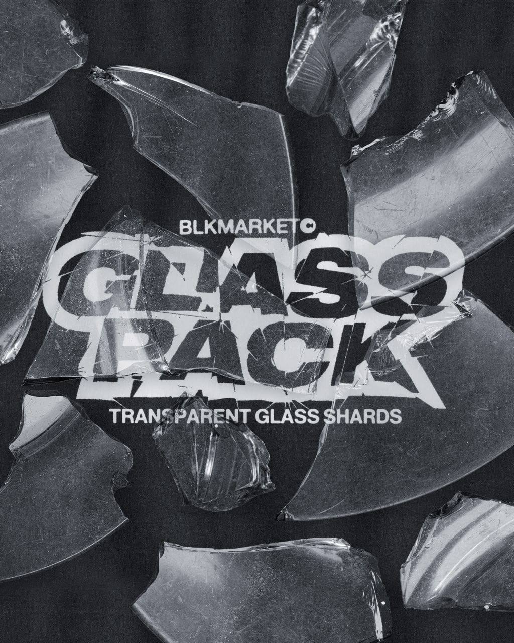
GLASS PACK — TRANSPARENT GLASS SHARDS
You can build everything by hand, but saving time without sacrificing credibility is a game-changer for daily work. GLASS PACK — TRANSPARENT GLASS SHARDS provides high-definition PNG shards with sharp edges, stable density, and consistent reaction to light. Their alpha channel transparency blends with masks and blending modes, their homogeneity avoids the "sticker" effect, and their retention across multiple formats protects the signature of your series. You compose a scene in minutes, adapt it without changing tone, and maintain the same "grain of light" between feed, page, and poster. Integrate them into a clean workflow, and let the diagonal of attention do its work. (Lifewire)
WHY THIS TUTORIAL ALSO SPEAKS TO BEGINNERS
The secret is not an infinite library of effects, but a clear and reversible sequence. You establish a lighting intention, you install a guiding main highlight, you secure the readability of the text, you adjust the material with small touches. The tools remain transparent allies: mask for sculpting, smart object for protection, blending mode for dosage. As you gain confidence, you refine the light's orientation, experiment with more subtle deformation, and vary the intensity of reflections according to the subject. The image becomes a controlled space, not a lucky accident, and glass, a way to tell a story without raising your voice.
RECAPITULATE WITHOUT SHORTCUTS
One single path of light instead of ten contradictory blinks. Smart objects and adjustment layers for fearless iteration. Blending modes chosen for what they do, not for what they promise. Exports framed by the right numbers. And a homogeneous resource that accelerates without impoverishing. If you maintain this line, your glass effect will be readable, credible, and above all reproducible, which matters most for a "Design" category that must inspire as much as it must deliver.


Share: